Posted on

How to Maintain Brand Consistency?

Your marketing efforts could include multiple and diverse initiatives that usually help expand your reach and stay top of mind. In order to ensure consistency, you should consider creating a set of guidelines that connect together the look and feel of all of your marketing materials. Also known as your brand standards, such guidelines will help you expand by creating awareness while developing the key differentiators your company has when compared to the competition.

Consider focusing your efforts on the following:

  • Your Colors – considering that you integrate colors in everything you do when it comes to marketing, advertising, communication and more, it is crucial to remember that this specific element plays a major role in leaving a lasting impression on your target marketing. As you commit to a palette, remember that every color has a different meaning and level of influence.
  • Your Logo – the design of your logo should be consistent but also is the case with its placement and sizing. Every communication is an opportunity to leave an impression on the recipient; from letterheads to postcards, from emails to brochures…
  • Your Graphics – The symbols and shapes you use for branding purposes should be consistent as well in order to help your audience to remember you as you work your way to stay top of mind.

Always remember that your brand is your promise to your customers and prospects about what they can expect, how you deliver and what makes you different in the marketplace.  Consistency should lead to strong equity increasing your customers’ levels of loyalty and commitment. Are you being consistent with your branding efforts?

Posted on

Trade Show Booth Design – The Lighting Effect

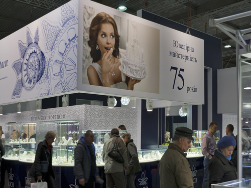
Tradeshow_3The setting, design and effect of your booth constitute the first impression that you will leave on the attendees of a trade show.  All of these elements can be turned into more effective resources if your lighting in your booth is set in a way to catch attention and entice people to learn more about what you do.

–          Dim lights are mainly useful in settings with a tone of romance such as a bar or restaurant.

–          Bright lights work best in a retail environment in order to keep shoppers alert and engage them in a fun experience.

The lighting of your booth creates the experience for your audience and adds a factor of engagement. As you design your booth and trade show setting, keep in mind the role of light so that you tailor a satisfying and appealing experience for your visitors as you introduce your company and services. With the right choice of light, you can bring focus to specific products/services or simply highlight your booth details.

Posted on

Effective Design for Trade Show Booth

Tradeshow_2Getting ready for a trade show could be an exhausting task that requires a lot of planning in addition to the actual set up of your space or display booth. Here are a few tips to help make your job easier:

–          Reach out to the management of the event and learn all the details including size, wall space availability, access to electrical outlets, and more.

Your products/services need to be the center of attention. As you plan your display, make sure that you do not overdo and clutter your space.

Keep your message simple and to the point. Stay focused on your core message that will leave a lasting impression and try to avoid bombarding the attendees with tons of messages that will go unnoticed.

Consider including a video on a widescreen projection/TV screen that can capture people’s attention.

Think about the reasons of why the attendees will stop at your booth – is it the product/service? Is it the design? Is it your welcoming message and nice attitude?

Keep it simple but be creative – Focus on building your brand and creating awareness for your product/service.

Consider opening up your booth by eliminating the table across the front and eliminating any barriers that will prevent the attendees from “walking in”.

You may want to implement the use of large, clean and attractive images. Keep it simple but consider bold for lasting impressions.

Posted on

The Right Font for Your Business Signs

SignMaking the wrong choice might simply hinder such a process.

Keep your audience in mind and think carefully about them when you start your design process.  Can you get their attention to read a lot of text?  Where will your sign be located? Is it going to be at a busy street where drivers are rushing to get to work or next to a cash register where your clients will have time to read it?

With the thousands of available fonts, try to keep the following in mind as you are making decisions:

  • Serif fonts, such as Times New Roman, are usually perfect for brochures, newsletters and business plans.
  • Sans Serif fonts are easy to read with large size text.
  • Script and Cursive fonts are perceived to be stylish and used for invitations and place cards.
  • Text fonts are the most difficult to read.
  • Novelty fonts can work either way depending on how you use them.

Another element to think about is the use of capital or lowercase letters. The use of all capitals might project yelling. A combination of capital and lowercase letters should be the easiest to read.

Posted on Leave a comment

Banner and Decal Campaign for Sports Bar by Focal Point Signs & Imaging Costa Mesa

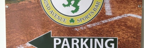
Recently our friends Chris and Kirsten bought a Sports Bar in Portland.  Their Logo (a family crest Chris proudly wears as a tattoo) became the central part of the branding campaign we created for them.  Using banner material to create “mini banners” for their Sidewalk A-frame, we created parking signage with a very specific look and feel that acts as an advertising extension of their brand.  Additionally, we created large window decals prominently featuring their logo.

I am proud to own a Sign Manufacturing Company and even prouder of the finished product that goes out the door because we hold ourselves to a pretty high standard. This video is a good example of the difference between a consultative relationship with your Sign company, and what is the norm in our industry – just taking an order and pumping out the job. My background in advertising lends itself beautifully to creating signage campaigns that protect and extend my clients’ brand as well as positively impacting sales. That’s what our goal was in this campaign. I’m happy to report that Chris and Kirsten are doing well in their new business venture, and I’d like to think we had something to do with it!

If you need banners, an A-frame, or window decals, give us a call at 714-204-0180.

Posted on Leave a comment

A brief guide on buying Banners from Focal Point Signs & Imaging in Costa Mesa

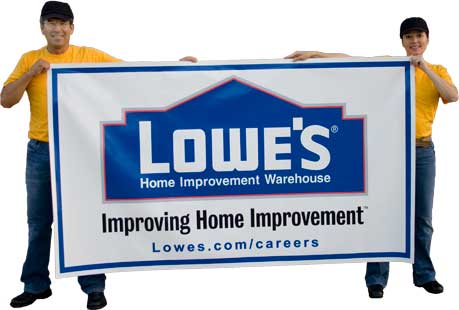
Banners are wonderfully versatile signage. They are durable and store easily, and are simple to put up and take down. Because banners are so popular, I thought it made sense to write a blog on how to discern good quality from not so good quality. There are so many options on ordering banners today, having a guide might save you some time and money.

The first question to ask yourself, is “how long do I need this banner to last?” If you’re ordering a small banner for a birthday party you don’t need high quality, unless someone at the party is particularly sentimental and wants to keep it for life. So, go ahead and order a banner online. You won’t need it to be hemmed, but you will need grommet holes to be able to tie in place your banner.

If you need the banner to last for several months then pony up for some quality. This is especially important if your banner is being displayed outdoors. The sun, wind, and changing temperatures will all take their toll over time. Also make sure to ask your printer or sign company what the weight of the banner material is. For example 10 oz banner material is not designed for this kind of use. Make sure you get 13 oz or better banner vinyl material.

Finally make sure your banner is hemmed. The hem will create a double layer of vinyl for the grommet rings. This means you’ll not have to be concerned about the vinyl ripping from the wind (unless of course there’s some bizarre Saharan Sirocco that comes from out of nowhere – these days you never know! Recently there was a tornado north of Tokyo…go figure).

Actually, if you do need a banner made for windy conditions ask for mesh banner. You’ve seen banners with half moon cuts in them to let wind through – this can be an alternative too, but if you know there will be a lot of wind, go for the mesh.

As for me and everyone here at Focal Point Signs & Imaging we focus on quality banners not only in terms of the material but the actual printing. We were smart with the equipment we purchased and went with the best available on the market which is capable of producing up to 1200 dpi – that’s photographic quality in large format. So if high quality is important to you, call today and make it a banner day!  714-204-0180

LowesBanner